Don’t Make These Logo Mistakes

Back in August, we wrote about some of the ways to get potential customers to notice your logo, such as using the right color and embracing simplicity. Unfortunately, it’s also possible for your logo to get noticed for the wrong reasons. Any company can make logo mistakes, even ones as big as Google. Back in the late 1990s, before Google got gargantuan, there was a brief period where its logo had an exclamation point…just like Google’s chief rival, Yahoo!
Copying someone else’s logo, even unintentionally, is an obvious example of what not to do when creating a logo for your custom shipping tape. Here are a few others:
 1. Using too many colors
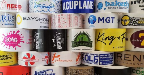
Color can be a wonderful way of grabbing people’s attention. If you spend some time looking at the custom polypropylene shipping tape on our website, you’ll see plenty of rich blues, bold yellows, and intense reds. The key here is simplicity. Using more than two or three colors can make your logo design seem too busy.
 2. Using the wrong colors
Not every color goes together. You might design a great-looking logo but turn people off by choosing jarring colors. Make sure the colors you choose are appropriate for your brand. A company selling children’s products would likely have different colors in their logo than an industrial manufacturing firm.
3. Using the wrong art files
The world of digital art files falls into two groups: raster and vector. Raster images are made up of a grid of picture elements, otherwise known as pixels, that form a larger image. Vectors are great for designing logos because of how they scale.
The same piece of art you put on your business cards or your custom shipping tape should look just as nice blown up on a poster or a billboard.
 4. Choosing the wrong font
Not all fonts will work in every setting. If you think you’ve found a font that works with your logo, test how it performs in other scenarios. Examine how it looks next to other fonts you use on your website or in print. If it clashes with your existing fonts, it’s time to look for something else.

You’ll also need to pay attention to typography in your logo. Some common typography issues include:
- Spacing – Are your letters too far apart? Too close together?
- Over-used fonts – Don’t just go with the go-to fonts. See what else is out there.
- Inappropriate fonts – You don’t want to use a “fun” font in a logo for a serious business (or vice versa)
 5. Getting too wordy
We’ve tried to keep our sentences short in this article. If our language gets too flowery, we risk losing your attention. The same is true with logo design. A company name and icon are often all you need.
Putting your logo on your custom shipping tape is important. It puts your brand front and center, essentially acting as a free form of advertising that hits everyone who sees your package. It also costs less than printing up boxes that feature your logo.
Let Phoenix Tape help you achieve that goal. We’ve spent more than 30 years helping companies large and small tell their stories with attractive, durable custom shipping tape. Contact us today to learn how we can help your logo and your company stand out with custom-printed PVC, polypropylene, or paper tape.

 1-800-992-1522
  My Account
 Register / Login
